Graphic Designs
Welcome to the graphic design side of my creativity. This section showcases work that turns ideas into visual impact, from brand logos and advertising concepts to illustrations, infographics, and campaign graphics. Each piece blends strategy with creativity, using strong visual hierarchy, thoughtful color choices, and intentional design to communicate a message clearly and memorably. Whether it is a concept campaign, portfolio cover, or brand-inspired project, my goal is to create visuals that capture attention, spark curiosity, and make an idea stick. Scroll through to explore work where strategy meets imagination and design brings the story to life.

"SHAI BASKETBALL" MVP Tribute Graphic
Digital sports graphic celebrating Shai Gilgeous-Alexander’s 2025 MVP season with the Oklahoma City Thunder, featuring dynamic in-game action imagery.
Role: Graphic Design, Sports Visual Storytelling
Format: Digital Graphic
This action graphic is a tribute to SGA’s incredible 2025 MVP season. I chose to use the Thunder’s signature orange and blue brand colors, with a touch of yellow to add a pop that catches the eye. I intentionally selected action shots of him from various angles in different Thunder jerseys to represent the consistency of his diverse range of high-level skills, highlighting the qualities that make him practically unguardable. This piece is where sports, storytelling, impact, and design all come together.
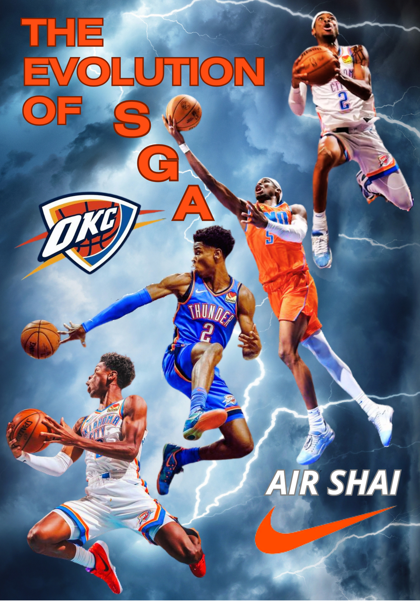
“The Evolution of SGA” Poster Design
Nike-inspired sports poster illustrating the rise and evolution of Shai Gilgeous-Alexander with the Oklahoma City Thunder.
Role: Graphic Design, Sports Visual Storytelling
Format: Digital Graphic
This poster was designed to visually depict Shai Gilgeous-Alexander’s growth as a player through a dramatic, storm-charged narrative. Each action image depicts a different stage in his development, symbolizing his progression toward becoming one of the NBA’s most dynamic guards.
The stormy sky and lightning elements emphasize energy, power, elevation, and the Thunder brand, reinforcing the concept of “Air Shai,” a nod to the iconic “Air Jordan” era, while also connecting to the Thunder’s identity. Inspired by the style of modern sports campaigns, the composition blends atmosphere, movement, and storytelling to celebrate SGA’s evolution into a defining Oklahoma City icon.

"SHAI 001" Sneaker Campaign Ad Mockup
Concept sneaker advertisement designed for the debut of Shai Gilgeous-Alexander’s first Converse signature shoe, the SHAI 001.
Role: Advertising Design, Campaign Concept
Format: Digital Advertisement Mockup
This concept advertisement highlights the debut of Shai Gilgeous-Alexander’s first Converse signature shoe, the SHAI 001. Inspired by vintage sneaker ads with a modern sports-campaign aesthetic, the design incorporates lightning to connect Shai’s identity with Thunder Basketball, while featuring his personal logo and Converse collaboration elements. The tagline, “Smooth like butter, sharp like Shai,” references the “Butter” colorway and his smooth yet precise playing style, while his signature adds a personal finishing touch to the campaign-style design.
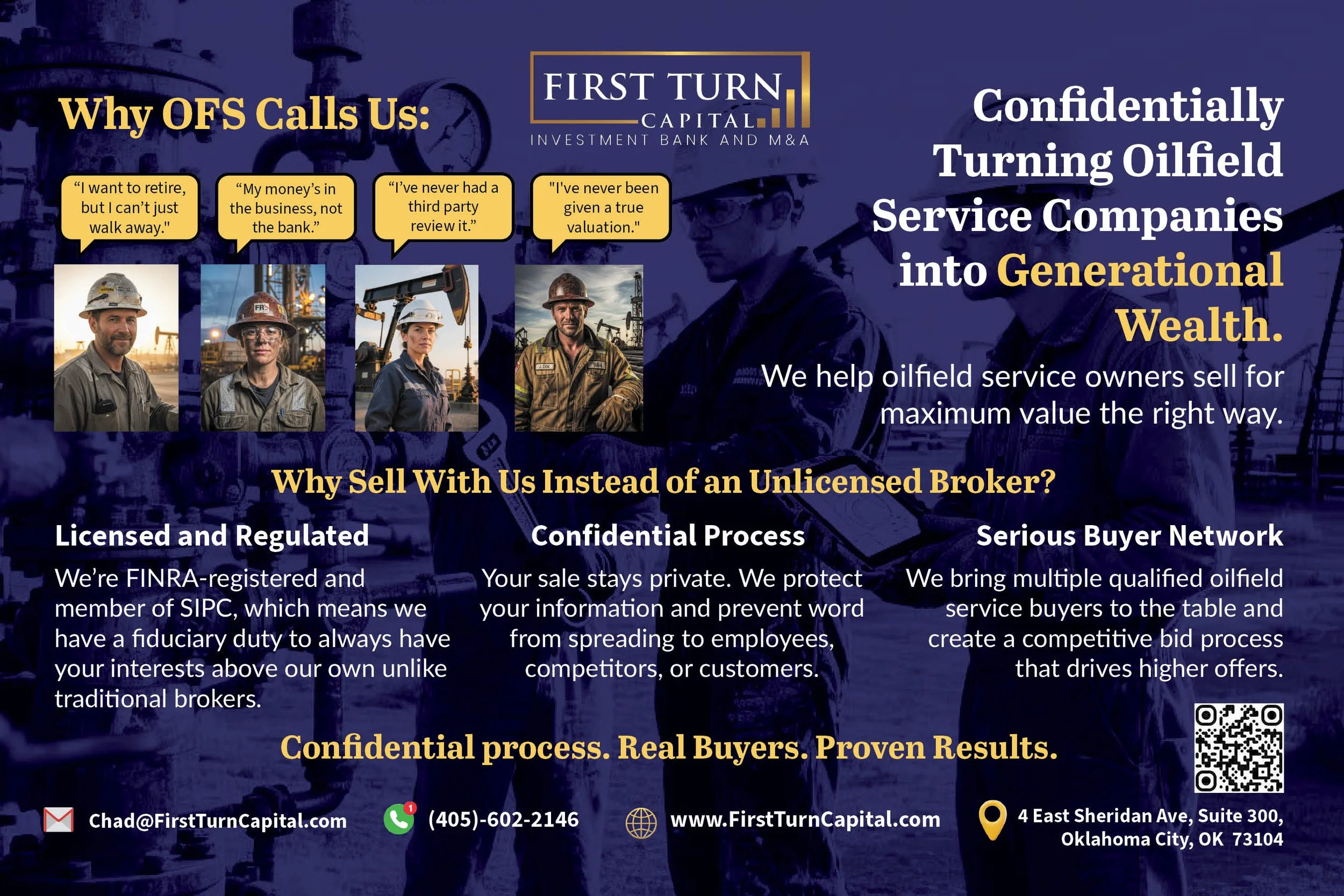
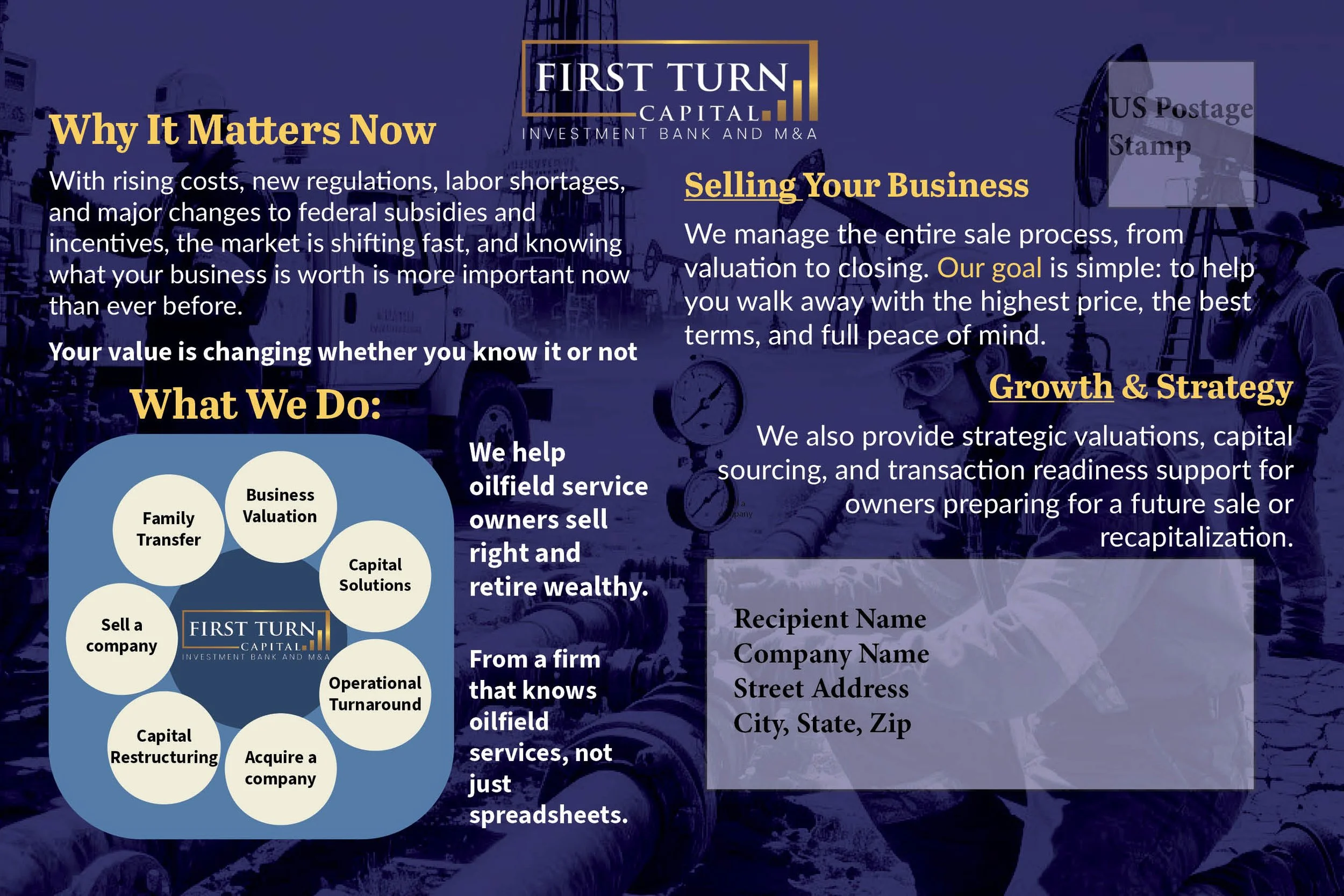
Oilfield Services M&A Outreach Campaign Postcard
Direct mail marketing postcard created for First Turn Capital to reach oilfield service (OFS) business owners who may be considering selling their company, obtaining a business valuation, or planning for retirement.
Role: Design, Copywriting, Marketing Strategy
Format: 9×6 Direct Mail Postcard
As Marketing Coordinator at First Turn Capital, I created this postcard as part of a targeted outreach effort to connect with oilfield service business owners, a key client audience for the firm. The messaging addresses common considerations owners face when evaluating a potential business sale, including valuation, confidentiality, and identifying qualified buyers. The design combines industry imagery, concise financial messaging, and a clear call to action with contact information and a QR code to encourage follow-up conversations.
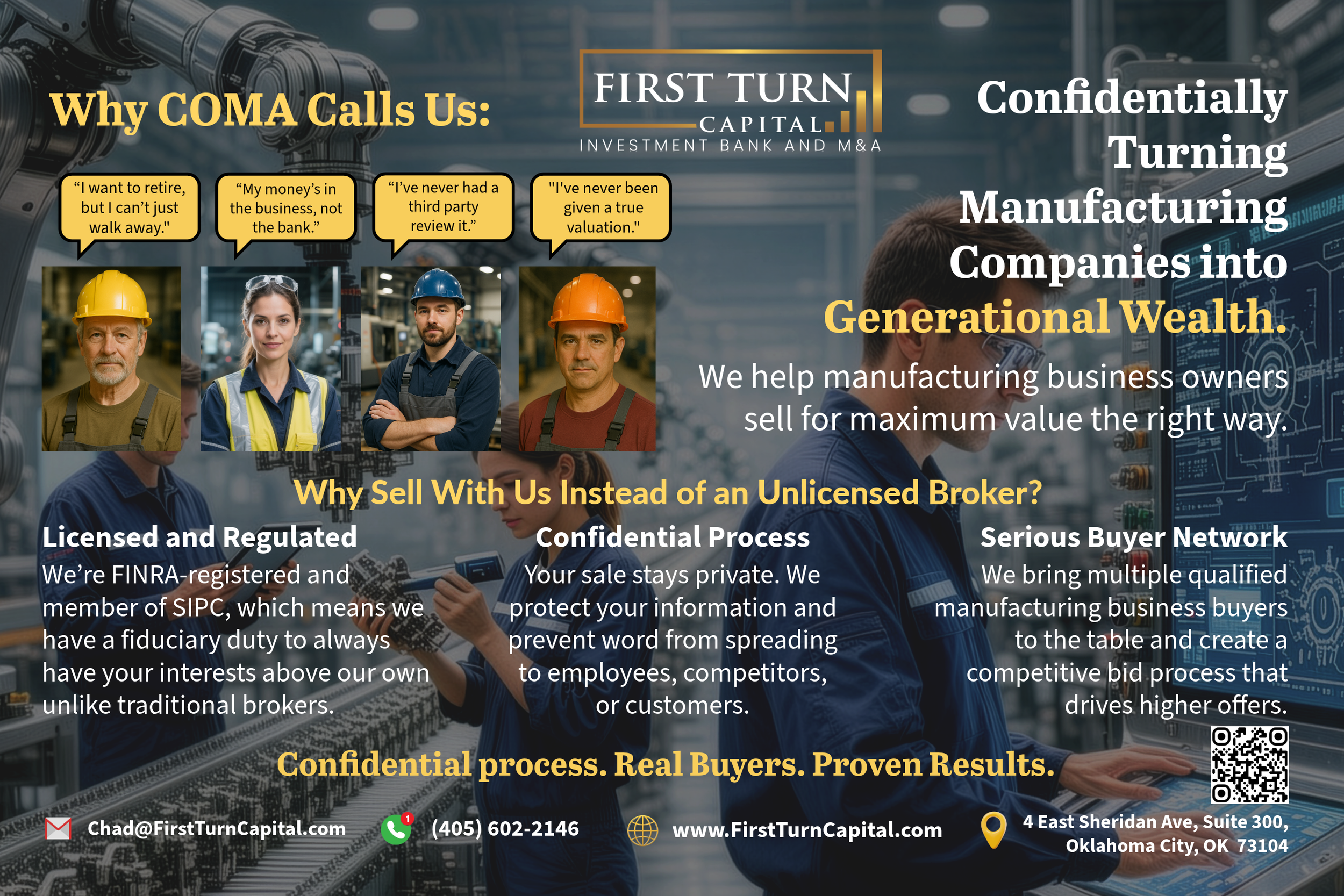
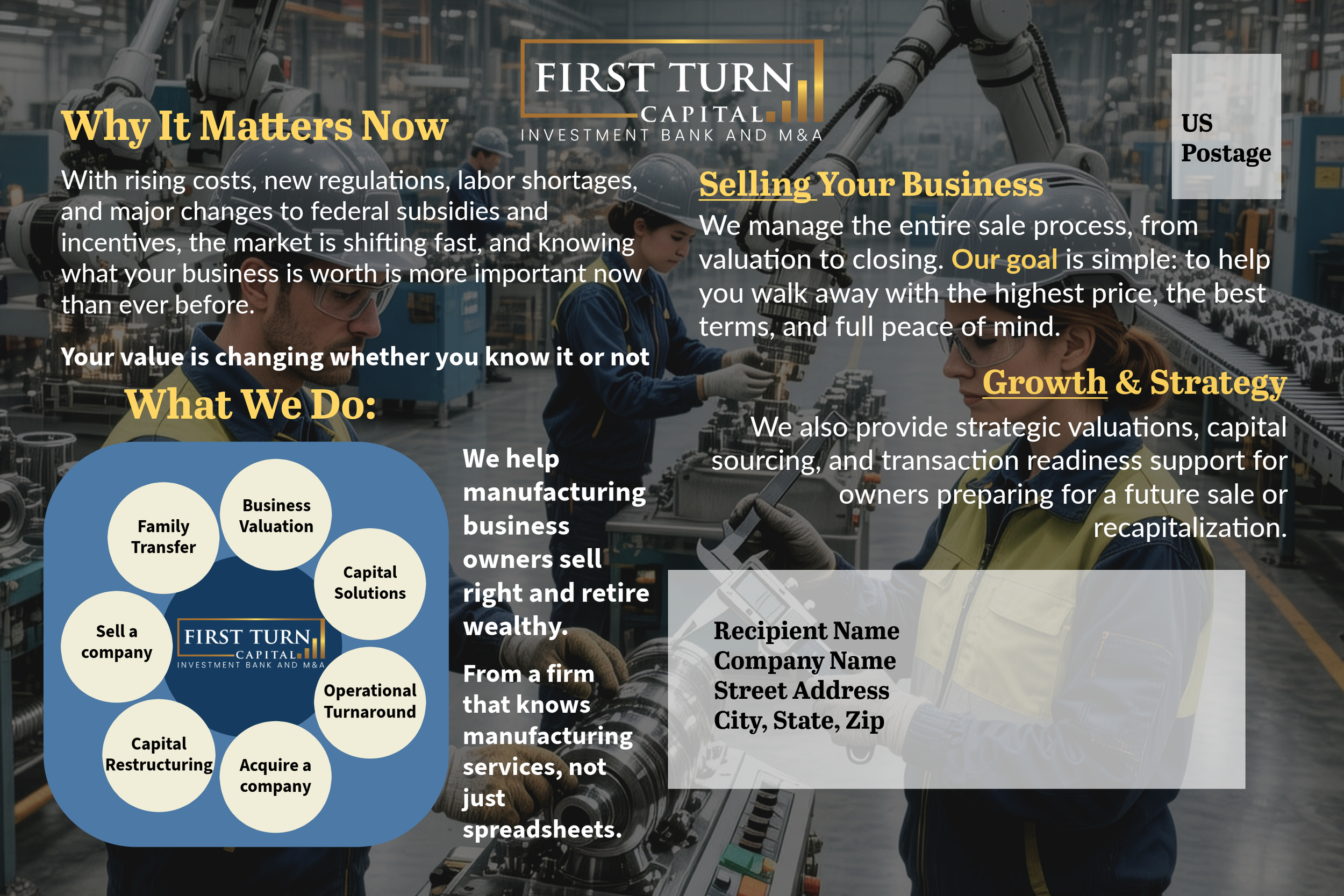
Manufacturing Businesses M&A Outreach Campaign Postcard
Direct mail marketing postcard created for First Turn Capital to reach manufacturing business owners who are members of the Central Oklahoma Manufacturing Association (COMA).
Role: Design, Copywriting, and Marketing Strategy
Format: 9×6 Direct Mail Postcard
I designed this postcard for First Turn Capital as part of a targeted outreach campaign to manufacturing business owners who are members of the Central Oklahoma Manufacturing Association (COMA). As a startup, the piece serves as the first stage of the marketing funnel, building awareness and introducing First Turn Capital and its services to prospects. The messaging addresses common considerations owners face when evaluating retirement, business valuation, or a potential sale. The front of the postcard uses relatable owner statements and manufacturing imagery to capture attention while positioning the firm as a licensed investment bank that helps owners confidentially sell their companies for maximum value. The reverse side explains why understanding business value is increasingly important, outlines the firm’s advisory services, and includes contact information and a QR code to encourage follow-up conversations. I intentionally chose to use imagery of manufacturing workers as the background to reflect the industry audience and foster relatability and recognition among COMA members.

“Welcome Back to Zero” 2026 New Year Social Media Graphic
Social media graphic designed for First Turn Capital to introduce a New Year message centered around a strategic reset and business planning.
Role: Graphic Design, Financial Marketing
Format: Digital Graphic
I created this graphic for First Turn Capital as part of a New Year social media post centered on reflection and strategic planning for 2026. The phrase “Welcome back to zero” represents the idea that the start of a new year offers a moment to reset priorities and think intentionally about the future. The design reflects the visual style often used in financial advertising, incorporating a city skyline and offices to evoke a focused corporate atmosphere. While created for social media, the minimal composition was intentionally designed with a billboard-style aesthetic, allowing the concept to scale across larger campaign formats.
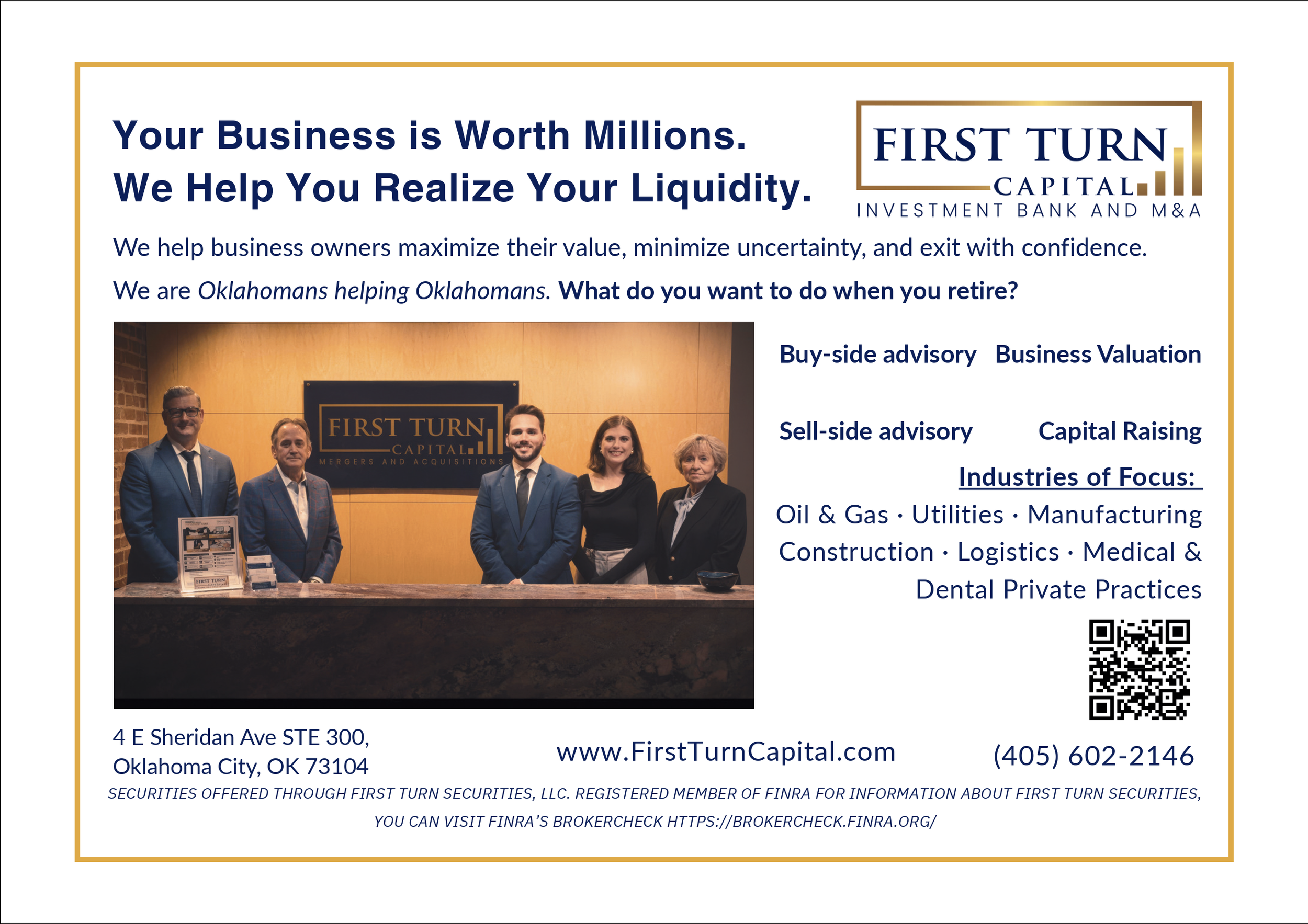
First Turn Capital Print Advertisement
Print advertisement I created for First Turn Capital and submitted to local Oklahoma City magazines to promote the firm’s investment banking and M&A advisory services.
Role: Advertising Design, Copywriting, Marketing Strategy
Format: Print Magazine Ad
I designed this print advertisement for First Turn Capital to introduce the firm to potential clients through local magazine placements in the Oklahoma City area. The opening headline, “Your Business is Worth Millions. We Help You Realize Your Liquidity,” was written as a bold hook to capture attention and resonate with business owners thinking about the future of their companies. Even for owners not currently planning to sell, the message encourages them to consider the long-term value of their business and think ahead about future goals, including retirement planning. The advertisement highlights the firm’s advisory services, including business valuation, buy-side and sell-side advisory, and capital raising. Clear messaging, company branding, and a team photo help establish credibility and identity, while contact information and a QR code invite readers to learn more. The ad was printed in multiple Oklahoma City magazines as part of the firm’s local awareness campaign.
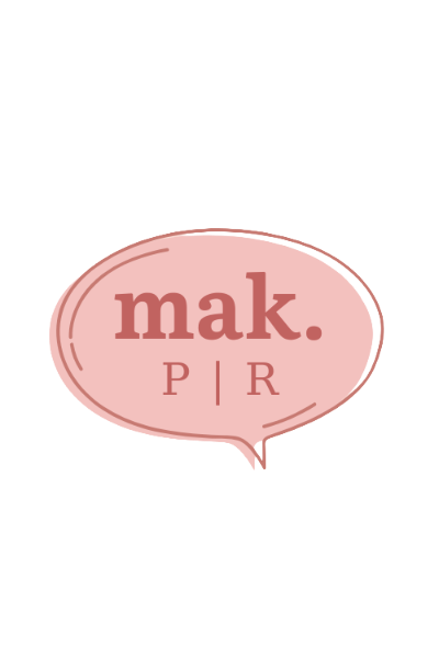
I created my personal brand logo to represent my identity as a public relations and communications professional.
Role: Brand Identity, Logo Design
Format: Logo Design / Personal Brand Identity
This logo is simple by design, but full of meaning. The speech bubble represents communication, the core of public relations. At the same time, the soft, grounded color palette reflects my brand’s tone: warm, approachable, and intentional. “mak.” stands for my initials, keeping it personal but still polished. Like good PR, the clean and open space let the message come through clearly. It’s both a visual signature and a creative reminder that every brand starts with a conversation.
Logo I created for Quail Ridge Farm, an equine-assisted learning and growth program focused on personal development through interactions with horses.
Role: Brand Identity, Logo Design, Brand Building
Format: Brand Identity, Company Logo Design
I designed this logo to represent the heart of Quail Ridge Farm and its mission of equine-assisted growth and learning. The rich green color palette was inspired by the trees surrounding the property, grounding the brand in the natural Oklahoma landscape. The oval shape references the farm’s original wooden sign, preserving its rustic character while refining it into a clean, digital brand mark. At the center, the horse illustration reflects the farm’s equine-assisted activities and healing mission. The overall aesthetic draws subtle inspiration from classic equestrian brands, blending timeless elegance with a warm, approachable, and down-to-earth feel that reflects the farm’s environment and values.

7 Clever Ways to Grow Your Audience Infographic
Educational infographic designed to present practical strategies for building and engaging a loyal audience across social media platforms.
Role: Graphic Design, Content Strategy
Format: Digital Infographic
I designed this infographic to visually communicate actionable strategies for authentically growing and engaging an audience. The layout organizes key ideas, such as defining your niche, posting with purpose, understanding your audience, and collaborating strategically, into clear, digestible sections. Icons, charts, and color blocks were used to break down complex ideas into an engaging visual format that is easy to scan and understand. The design balances educational content with approachable visuals, turning audience growth strategies into a clear, practical guide for creators and brands looking to expand their reach while building meaningful connections.

Cinderella Character Illustration
Digital character illustration recreating Disney’s Cinderella using Adobe Illustrator as part of a PR Publications design project.
Role: Illustration, Graphic Design
Format: Digital Illustration
I created this illustration in college for my PR Publications course, where we were challenged to recreate our favorite Disney character using Adobe Illustrator. I chose Cinderella because of her timeless elegance, charm, and the nostalgia associated with the character. The project allowed me to practice vector illustration techniques while exploring character design through clean shapes, color layering, and simplified details. It was both a technical exercise in digital illustration and a creative opportunity to reinterpret a classic character in my own visual style.

80s Throwback Mixer Event Flyer
Promotional flyer designed for an OU Parents Weekend event as part of a PR Publications course project.
Role:
Format: Event Flyer / Print Design
I designed this flyer in Adobe InDesign for a PR Publications class project where we created promotional materials for a Parents Weekend event. I developed the concept of an “80s Throwback Mixer,” designed to connect with parents who grew up in the 80s while creating a fun, nostalgic atmosphere. The layered neon colors, bold typography, and paint splatter textures were inspired by the high-energy visual style of the 1980s. The silhouetted figure with a raised fist references the iconic final scene from The Breakfast Club, adding a subtle pop-culture nod that reinforces the decade’s identity and playful nostalgia.

Client Campaigns Section Cover Graphic
Portfolio section cover graphic designed to introduce the Client Campaigns portion of my portfolio and highlight my creative approach to brand storytelling.
Role: Graphic Design, Creative Direction
Format: Digital Graphic / Portfolio Section Cover
I designed this graphic as the introductory cover for the Client Campaigns section of my portfolio. The bold typography, vibrant color palette, and collage-style elements were chosen to reflect the creativity and energy I bring to client work. Phrases like “your brand reimagined” and “your voice, amplified” represent my approach to public relations and branding, transforming a client’s vision into something distinctive and impactful. The design sets the tone for the section by visually communicating expressive, attention-grabbing work that is both strategic and creatively driven.

Editorial-inspired portfolio cover designed to introduce the Writing Samples section and preview the types of public relations content featured in the portfolio.
Role: Graphic Design, Creative Direction
Format: Digital Graphic / Portfolio Section Cover
I designed this editorial-inspired graphic as the opening cover for the Writing Samples section of my portfolio. The layout draws visual inspiration from fashion and pop culture magazines such as Vogue, using varied typography, bold headlines, and layered design elements to evoke a magazine spread. The phrase “Inside the Issue” acts as a hook that invites the viewer to explore the writing pieces that follow. By previewing content such as press releases, media advisories, magazine features, and newsletters, the design introduces the range of work in the section. The overall aesthetic combines personality and polish to set the tone for writing that is strategic, engaging, and built to make headlines.

Graphic Design Section Cover Graphic
Portfolio section cover graphic designed to introduce the Digital Design portion of my portfolio with a retro-inspired visual style.
Role: Graphic Design, Creative Direction
Format: Digital Graphic, Portfolio Section Cover
I designed this graphic as the cover for the Digital Design section of my portfolio, drawing inspiration from the bold and playful aesthetics of the 1990s. The colorful hand-drawn lettering, retro television frame, and nostalgic sneaker styling were chosen to capture the energy of a throwback creative era. The vibrant background and collage-style composition reflect the expressive and experimental nature of digital design. I wanted the piece to feel fun, nostalgic, and full of personality, setting the tone for the creative work featured in the section.

Web Design Section Cover Graphic
Editorial-inspired portfolio cover designed to introduce the Web Design section and highlight my creative approach to building visually engaging websites.
Role: Graphic Design, Creative Direction
Format: Digital Graphic / Portfolio Section Cover
I designed this graphic as the cover for the Web Design section of my portfolio, drawing inspiration from the editorial style of fashion magazines and picture collage layouts. Layered photography, playful typography, and the confident tagline “I am just a girl with ideas” were used to communicate creativity and personality. Pops of red and pink add energy and attitude, while the collage-style composition reflects a modern and expressive design approach. The graphic sets the tone for the section by introducing web work that blends creativity, clarity, and strong visual storytelling.